Our Work
WorkWell
Black Sheep helped WorkWell to revitalise their workplace wellbeing programme with a new website and bespoke member portal.
workwell.health.nzBlack Sheep helped WorkWell to revitalise their workplace wellbeing programme with a new website and bespoke member portal.
workwell.health.nz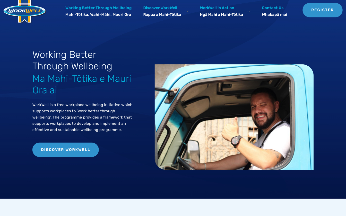
Framing the problem
WorkWell is a free workplace wellbeing initiative from Te Whatu Ora that supports workplaces towards ‘working better through wellbeing’.
The WorkWell team came to Black Sheep for help refreshing their public-facing website and outdated member portal platform, bringing them up to modern security, performance, and user experience standards.
-
The website and member portal were custom-built and disjointed, creating a clunky user experience.
-
The design felt outdated and lacked credibility.
-
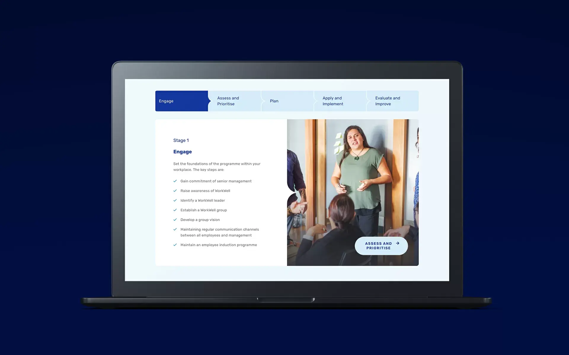
The program itself is quite complex, and the website was not flexible enough to create a user journey that guided prospective members through understanding the program structure and benefits.
-
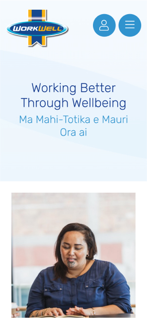
The user experience of the membership portal was clunky, dated, and not mobile friendly.
-
The portal was built on an end-of-life CMS that was no longer supported, and used an outdated version of PHP meaning it was open to security vulnerabilities.
In short, it was high time for an upgrade!
Unpacking the brief
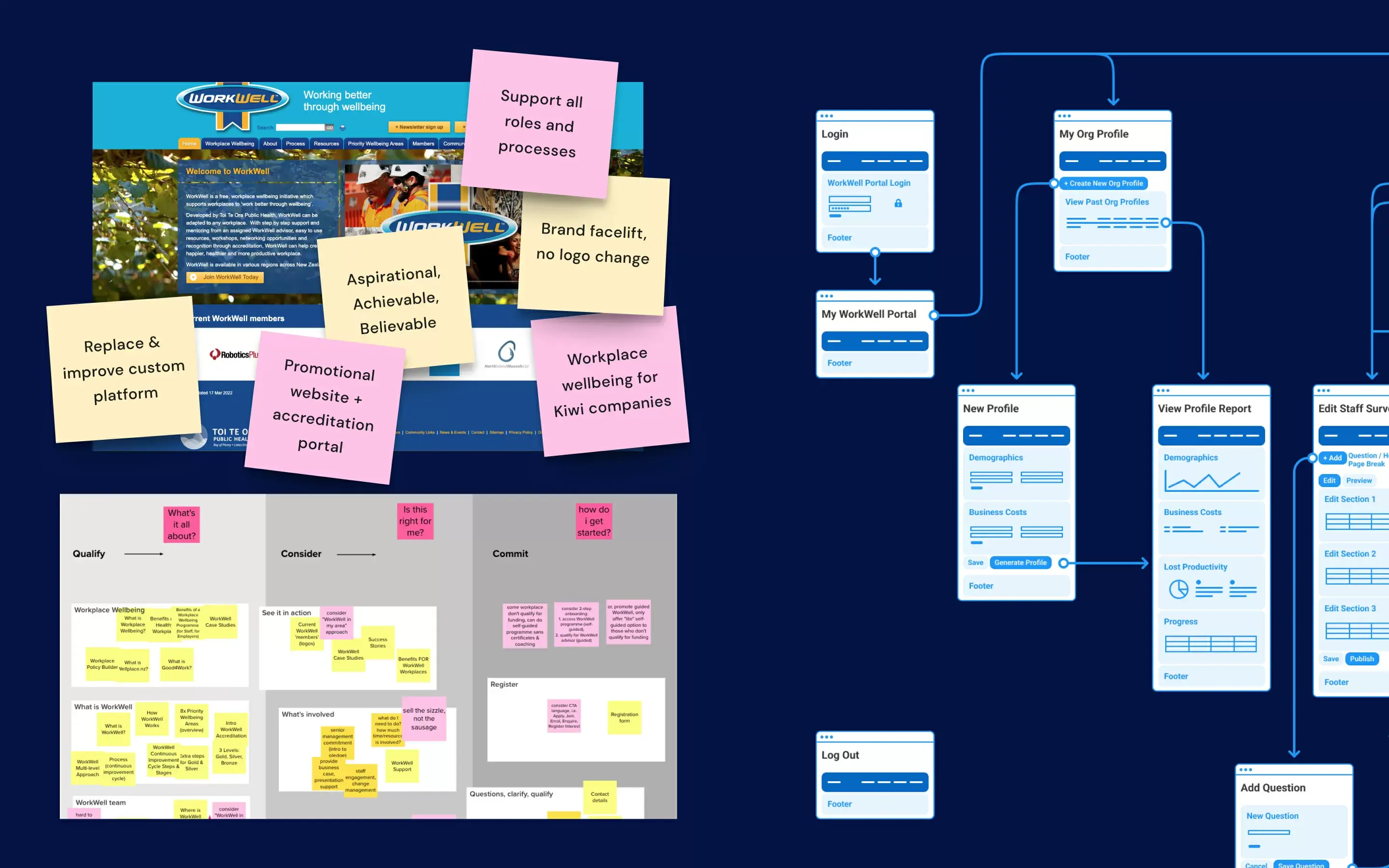
The Black Sheep team started learning about both the business and user needs through an in-depth discovery process, including multiple stakeholder workshops. This allowed us to gain a deep understanding of the challenges facing both the programme and their users, and a better look into how the different target markets wanted to engage.
Using collaborative ideation tools (Mural), we worked closely with the WorkWell team across the motu and distilled our insights recommendations into a playback report as a guiding strategy for the rest of the project.
"The WorkWell website is a complex tool that is central to effectively implementing our WorkWell Programme, and it was great to know that it was in the trusted hands of Black Sheep."
Alice Walker, Public Health Planner
Designing an ideal solution
Design
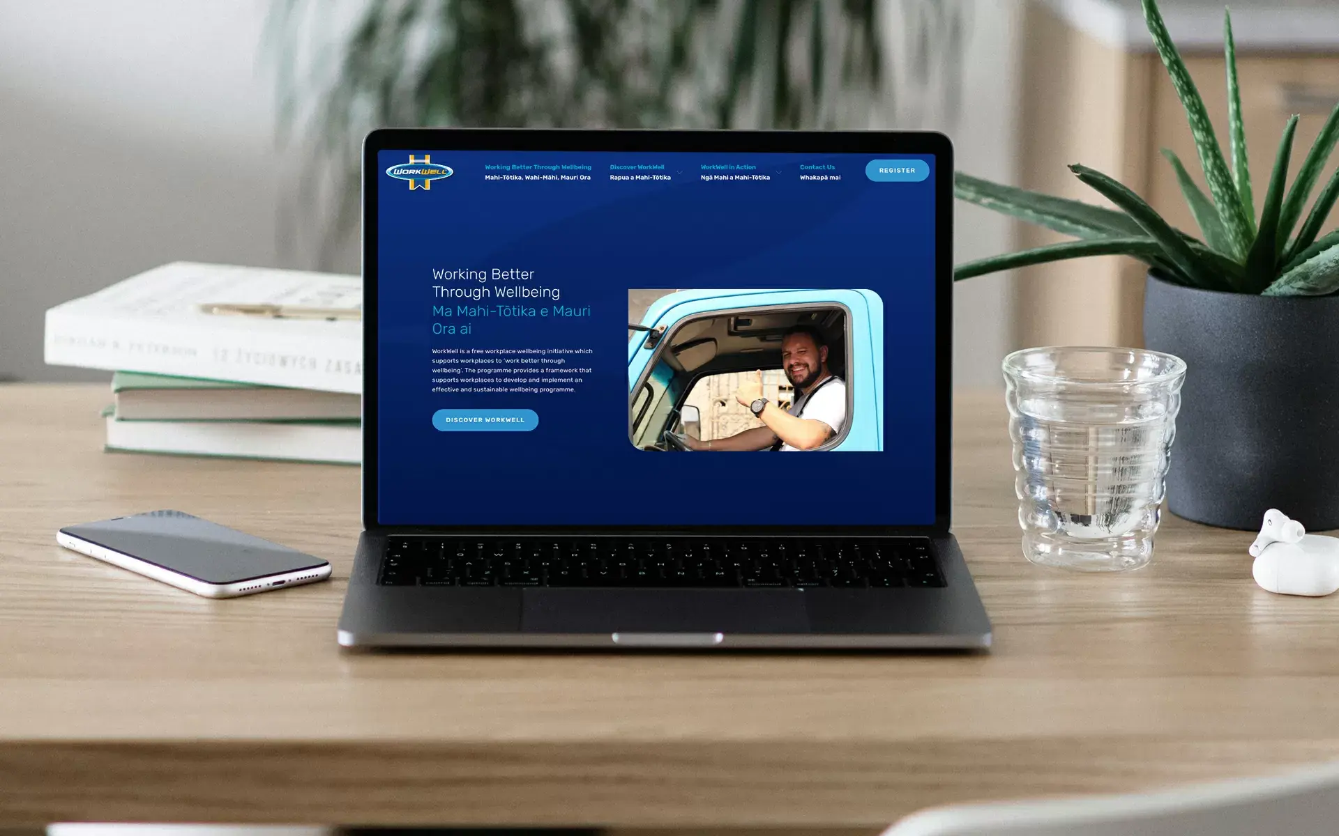
The website needed to promote the idea that everyone benefits from better workplace wellbeing and provide evidence the programme really works to generate new enquiries. The member portal needed a modern user experience to make the complex programme engaging and easy to use.
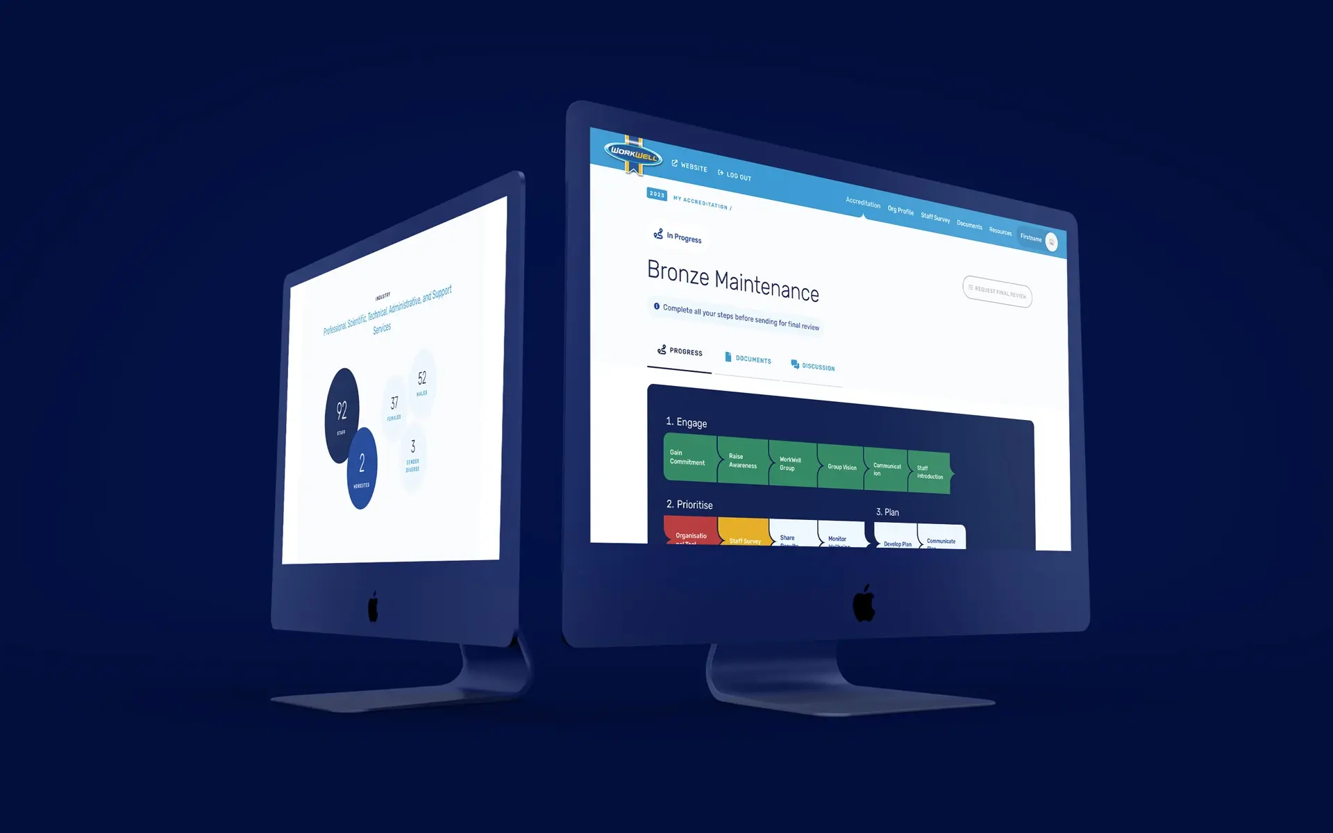
High-fidelity wireframe prototypes of both the website and the member portal detailed the functionality and mapped the user journeys.
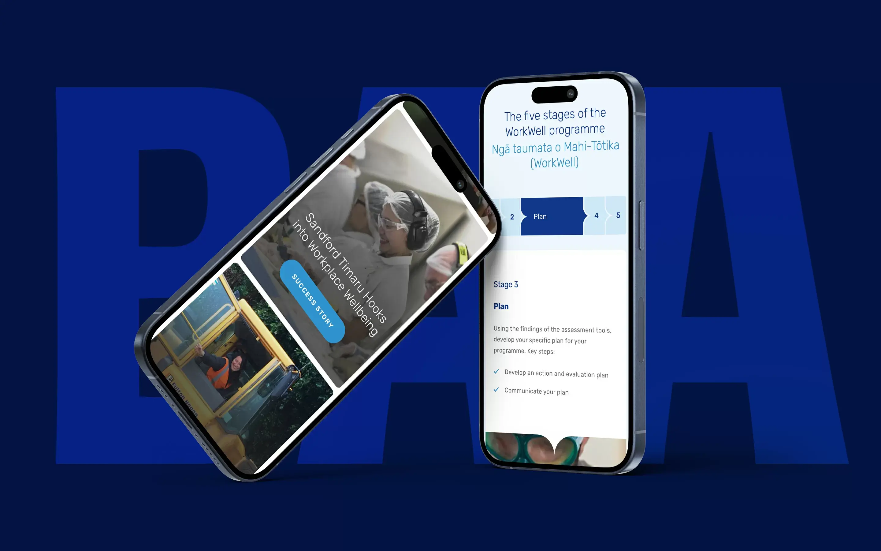
For the website, we focused on highlighting the programme's core benefits and showcasing relatable member success stories to celebrate achievements and convince prospective workplaces with tangible proof.
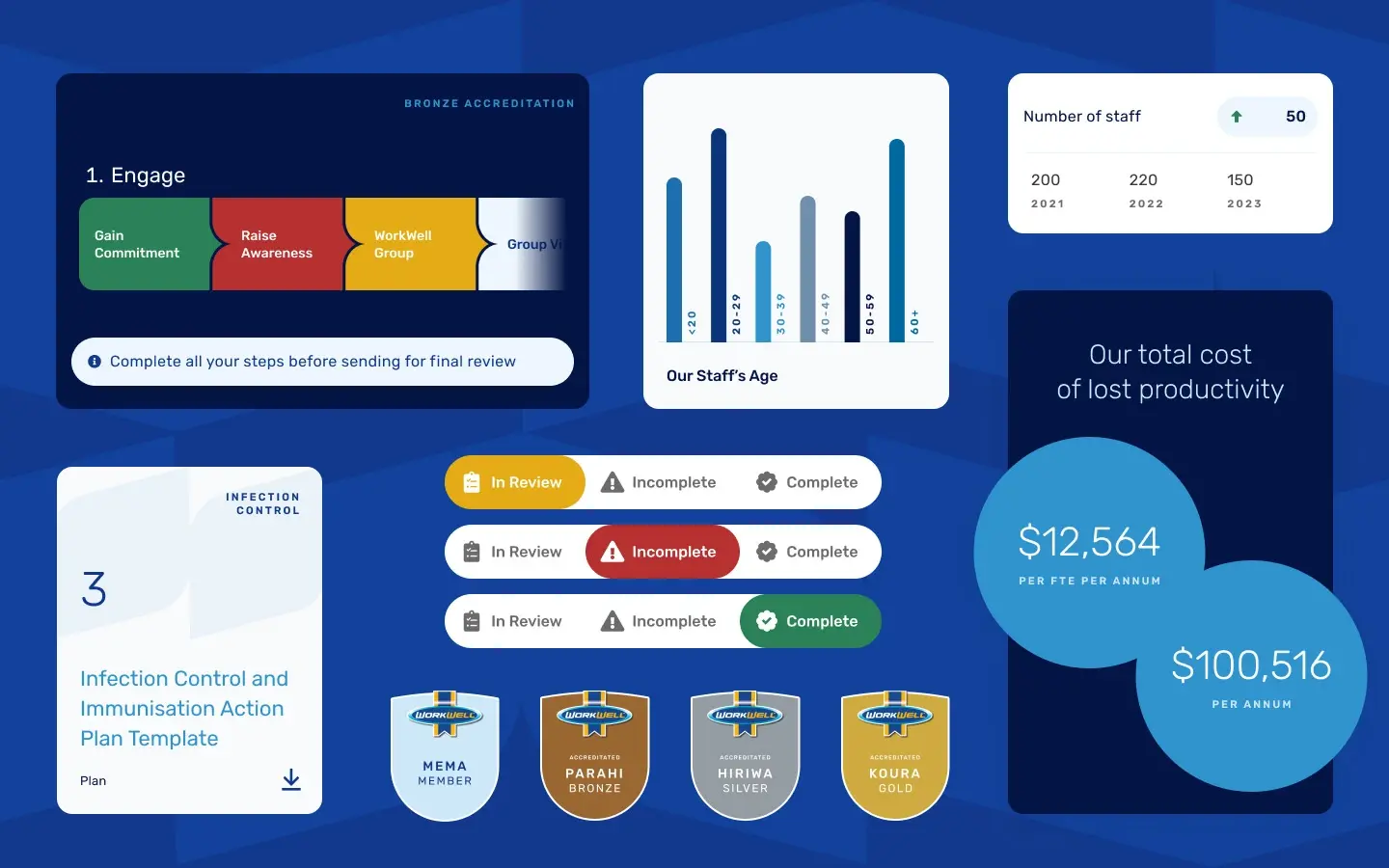
In the portal, members are coached by WorkWell Advisors along their pathway to accreditation, tracking progress and recording evidence at each step. A key part of the user experience journey is a comprehensive workplace survey where we guided participants through more than 72 questions in paced steps with clear prompts to avoid anyone getting overwhelmed or stuck.
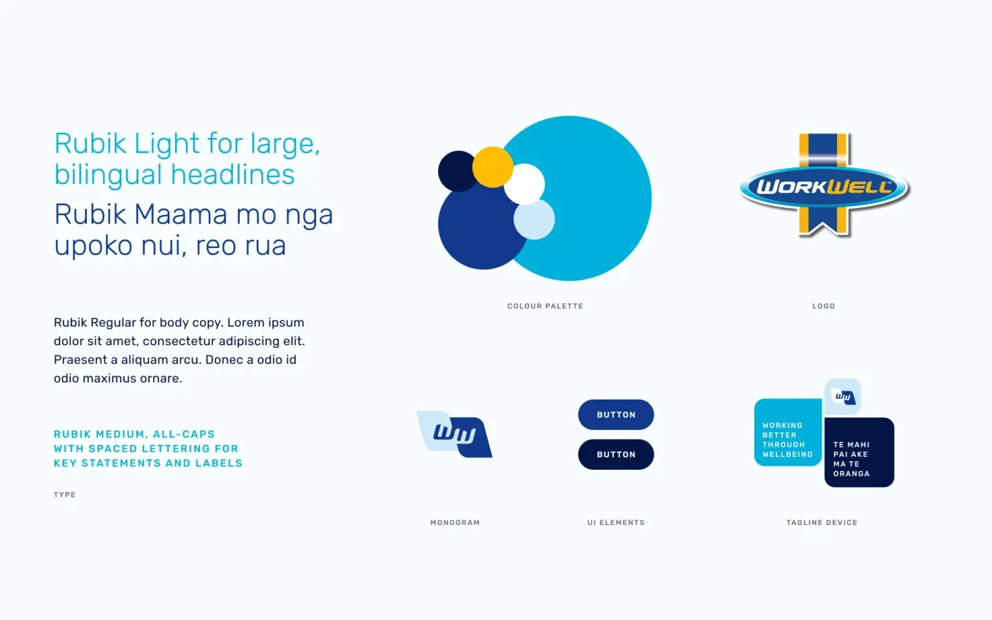
We then applied WorkWell's visual identity across both website and portal, bringing personality and emotion to the functional elements with fresh new brand patterns, devices and treatments that can be carried through their marketing collateral.
Development
Development was completed by a cross-functional team of back-end and front-end developers from Black Sheep and Enlighten Designs.
Silverstripe was WorkWell’s CMS of choice because it is a CMS they’re familiar with and already using elsewhere in the organisation. Silverstripe CMS was used for the website, while a headless version was used to power the backend of the portal, with NextJS application providing the front end. This solution gave us the flexibility needed for a great user experience for the form-heavy portal and results displays.
Set up for success
The website and portal were launched at the same time.
For the portal, we built in controls for admins to alter and update the surveys without compromising the data structures, giving them plenty of flexibility.
The website was built with an elemental structure, meaning web admins can rearrange page design to suit their content, future-proofing the website for years to come.
"Black Sheep took the time to understand our needs, were clear and proactive with communication and finding solutions, and were able to work to our budget and timeframe constraints."
Alice Walker, Public Health Planner

